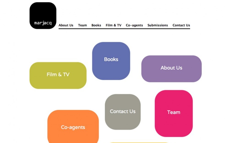
We worked on this site for a bit. This is a literary agency who wanted to re-vamp their site. They where looking for a minimal, white easy to navigate site, that was viewable on PC, Mac as well as on mobile and tablet technology. They also asked to have some kind of animation. Being they wanted a site that worked on mobile devices as well as on traditional computers we had to accommodate an HTML5 animation.
A little cute touch was that all links, including the footer change colour depending on the section of the web the user is in.
We also has to tweak the settings so that when they updated the authors by adding new books the picture of the book gets uploaded to the right aspect ratio as not all books are rectangular!
The real thing looks a lot better that just the picture of the home page. Personally I like the team homepage the best, though the animation of the home page is really fun.
This site was designed me (Veronica) and implemented by my company of London Drupal developers called AeonDada.
ooo really like the use of CSS3 effects on the homepage. A very nice clean and open design.
Great;) Really simple but stylish....been reading a lot of late about how to design sites to reduce bounce rate.....and not confusing the visitor with two many options to begin with was one of them.....think this works in that respect
Neil
Tinnitus Magazine