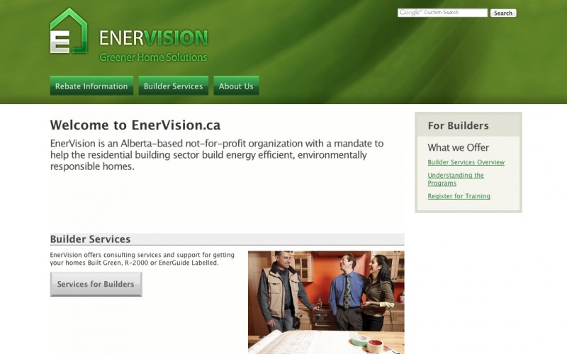
EnerVision does green building consulting and certification in Alberta. In addition to providing information about what we do the website includes an online database for available rebates and an inquiry system to help us manage call volume.
One of the biggest design goals was usability and organization of content, as proselytized by Jakob Nielsen (of useit.com fame; and yes, I think his website is horrible despite his excellent understanding of usability.)
I built a custom theme as well as used CCK fairly heavily for the rebates database as well as contact page. Important modules I used were block theme, webforms, and menu breadcrumb. By organizing the sites content into an (invisible) menu, called Site Map, I could keep breadcrumbs highly organized, provide an actual site map (using the sitemap module, I think) and also keep a clear picture conceptually of where all content was located.
The site is fairly CSS-pure; I don't think I used tables for layout anywhere. There are of course a few hacks in place to deal with IE.